I've also been quite taken with other transport visualisations in the past, done by the likes of Flink Labs and using ggplot2 in R.
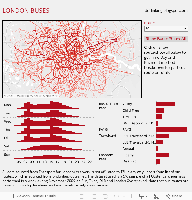
So here's my contribution to the transport network visualisation community - a bus route map of London, powered by Tableau Public. Enjoy. All copyright, etc. is to TfL. To see information about a particular route, just choose the route from the drop down and then click the update button in darker grey. Clicking that button again will show all the routes.
The geeky bit...
TfL are kind enough to provide the information for all their bus routes in an easy to read JSON format (as a by product of plotting a route on a google map), which when combined with a bit of code and information on all the routes in London (from londonbusroutes.net) enabled a relatively easy piece of scraping to get all the stop coordinates (you'll see that where a stop is around the corner from the previous one, there's a nasty diagonal line through a building).
The Oyster card data was much easier to get hold of, as TfL make it available to developers as a csv. I would normally put this straight into tableau and give full flexibility to do whatever analysis I wanted to, but Tableau Public is limited to 100k rows (the dataset has more than 1.5million rows in total and more than 700k for bus journeys). So I used R to create various summary statistics at route level - the day and time charts and payment method. I have to say that the data.table package is amazingly quick at aggregating data and proved a life saver to get the data at the right level.
Very nicely done map work.
ReplyDeleteHi,
ReplyDeleteVery lovely map!! I am based in SA and would like to do some analysis on the raw data (I have a tableau pro licence) to show what may be possible to our transport guys on this end. Are you able to provide me with the csv, or the details of someone i can contact at TfL.
Thanks
Ndabezinhle Nkomo
Hi
ReplyDeleteProbably best to access the data via a tfl request at:
http://www.tfl.gov.uk/businessandpartners/syndication/16492.aspx
cheers
mark
This is probably the best use of the Tableau maps I've seen! And I work for the place!
ReplyDeleteVery nice visualization. I have been wanting to analyze New York subway routes through Tableau for some time, but am having trouble figuring out how to import the data. I have Tableau Desktop, and I have the routes as shapefiles, .lyr, .kmz, and .nmf. Can you offer any guidance? Thanks!
ReplyDeleteDear sir,
ReplyDeletea. Wow, that is honestly one of the nicest bits of Tableau work I've seen -- kudos!
b. Having just requested the stop/route data from TfL (and realizing it's all in Eastings and Northings), words do not express how happy I am that you used Tableau for this (and can thus use your data and not theirs...).
On that note -- how did you get the JSON of bus routes in the first place? I'm rather curious...
Cheers,
-Æ.
London double-decker bus into a mechanical sculpture of an athlete doing push-ups to celebrate the Olympic Games opening in the British capital on Friday. The bus is installed outside the Czech Olympic House in London's Islington neighbourhood. apartments in london
ReplyDeleteMmm.. good to be here in your article or post, whatever, I think I should also work hard for my own website like I see some good and updated working in your site. london river cruise
ReplyDeletevery good working..your working very hard.. thanks for your info..
ReplyDelete