Tuesday 23 November 2010

US Crime Bubbles

Flowing Data and The Data Studio have both published bubble charts showing the relationship between murder rate, burglary rate and population. I thought I would take this a step further and look at how this changes over time.

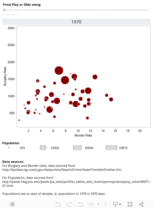
The visualisation allows you to see the rates of burglary and murder in all the states for any particular year. If you click on any one of the bubbles, it will show you the trail for that state since 1970 - so go to 2008 for a full trail and see how New York has changed over the time for instance.

Note that Tableau Public doesn't support the playback feature, so you'll need to download the workbook and open in reader to fully enjoy the animation. Try clicking on one of the circles in 1970 and then track how murder and burglary rates change over the 40 years by pressing the play button. California is an interesting one.


The Technical Bit

I sourced the data in the main via http://bjsdata.ojp.usdoj.gov/dataonline/Search/Crime/State/TrendsInOneVar.cfm and then transformed it into something more tableau friendly using the Tableau Add-In for Excel (this flattens the cross tabs).

To get hold of the population data, I used data here. As this is at ten year intervals, I used the floor function in excel to tie each individual year to the start of the decade it was in, so 1979 would be tied to the population in 1970.

Monday 22 November 2010

Infochimps

Infochimps has been around for a little while now and first came to my attention with its twitter data repository. It seems best described as a "data clearing house" where you can buy and sell data (some of the good stuff is actually free).

In came to my attention again today as the ever interesting Drew Conway (also part of the dataists) released a 0.1 version of an infochimps api wrapper for R. This makes it very easy to get data from infochimps for other uses.

Within the package and api, it's possible to get the geolocation of an ip address (this is by far the best, and by that I mean cheapest that works, tool for doing this), or a whole list of ip addresses for that matter. You can query up to 2000 an hour free of charge (up to 100k a month) - higher rates are possible for various (typically small) amounts of money.

It's also possible to get a twitter user's influence score (the score is calculated by infochimps). Again, the same api usage rates apply.

A visualisation using some infochimps data will follow shortly...

Wednesday 17 November 2010

The Tweet Police


The visualisation below shows those tweets using Tableau Public - by time of day, by keyword groups and the content of the tweets. For instance, try typing "youth" into the search box on the viz and the time series of tweets is filtered to only those including the word "youth". Also, try clicking on one of the hour bars to see the keyword trends for that hour - it's possible to see the most incident packed part of Manchester for any particular hour of the dataset.


The technical bit...

I used python and the tweepy library to get all the tweets from the four accounts that the GMP used - the twitter api is quite easy to interact with and by using the minimum tweet id as a filter, it was easy to get the older tweets. I then stored the data in a local MySQL database and used NLTK in python to break the words down into individual objects to then count up. Good thing about tweepy and python is that OAuth is a lot easier (seems to be impossible currently in R).


Tuesday 16 November 2010

Is Facebook the new kettle?

The new series of I’m A Celebrity, Get Me Out Of Here (or IACGMOOH to those that like acronymns) kicked off on ITV on Sunday night. As is the case with many things in this day and age, there are a number of ways to fly the flag for the programme above and beyond just watching it.

One of those ways is via being a fan of the IACGMOOH on Facebook. If you want to be a fan of the programme on FB then it is just a matter of clicking on the like button at the celebrity.itv.com site and you can let all your friends know of your allegiance to IACGMOOH.

Likewise, you can also “like” any of the contestants in the show by clicking a “like” button on their individual page.

And now the technical bit…
I was curious as to how the number of fans of the show changed through the course of the programme and so set out to first collect and then visualize the data.

The Facebook Graph API (documentation here) offers some very easy to use http-based queries to get hold of data about such things (as well as status updates where users have fairly lax privacy settings, but more about that another time). For example, try clicking on this link: http://graph.facebook.com/search?q=football to get the latest 25 publicly available status updates mentioning football.

In the case of being a fan, the query is of the form http://graph.facebook.com/?ids=nameoffanpage which returns some JSON data. In the case of celebrity the ids is “Imacelebrity”. For any other page, go the page and look at the URL in the address bar to get the page name.

To collect and turn this data into something more tabular, I used R (and particularly the RCurl and XML libraries) to parse the data and then stored it in a MySQL database. The script ran once a minute for the duration of the show to build up a time series dataset.

So what happened?


Looking at the data for the first show then, the average number of incremental fans per minute (fpm) during the 90 minutes of the show + 10 minutes after was 185 fans, with a peak of 323 fpm at 22:32. There seems to be peaks during the programme breaks for the programme, with the biggest spike occurring at the end of the programme – rather than putting the kettle on, ad breaks and the end of the programme seem to be the time to go online.

Who owns America's debt?


The ever wonderful Guardian Datastore has published the latest US Treasury debt figures which are up to August 2010 and show where in the world American debt is held.

I've visualised the data using the brand spanking new Tableau Public 6 to show both where the debt is held geographically along with some time series charts to allow inspection of individual countries debt holdings over time.

At the total level, debt holdings and the form of the debt are relatively unchanged month on month - the one notable exception to this is March 2010 which has clearly anomalous data in terms of the forms of debt (something that the Guardian datablog acknowledges, but apparently is also incorrect in the original published data).

However, looking at country-by-country holdings, something strange seems to be happening to UK holdings of American debt, which have grown from around $100bn in 2008 up to $400bn in the latest figures (to put this in context China held about $500bn in early 2008 and that was a concern for some). Given the current state of public finances in the UK, it is unlikely that the UK government is holding this debt.

A quick google search sheds only limited information, the best being here which suggests that:

"We put the UK in parentheses as the end purchaser in this case is anyone but an an austerity-strapped and deficit reducing UK. Whether this is the domain of the mysterious direct bidders, an offshore FRBNY holdco, or just Chinese buyers domiciled in the UK, continues to be unknown."